JavaScript not loaded. Some parts of this site need JavaScript to work properly. Please enable it for the full experience. If already enabled, try refreshing the page.
- Photo
- Enmore market, Guyana
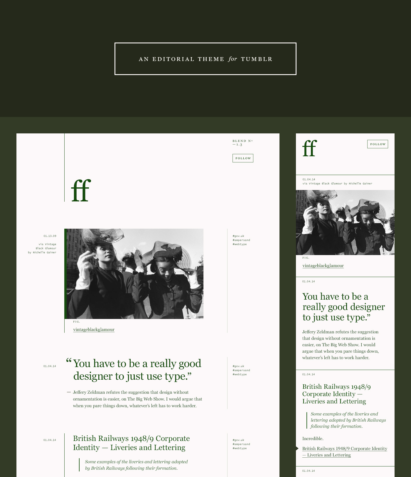
An editorial theme for tumblr
In 2010 I was looking for a sober, type-led blogging theme to start jotting down design realted musings as they occured to me. I’m not skilled at writing and my ideas are few and far between, but as @RellyAB once said,
To become a good writer, you need to do a lot of shitty writing first.
By using the tumblr platform, the predicted paucity of updates could at least be mitigated with ‘re-blogging’ the content of others. It also had the benefit of being separate from my portfolio in case it was complete garbage.
There were (and still are) a wealth of themes to choose from, but I couldn’t find precisely what I was looking for. Either the type choices didn't jive with me, it had artefacts or detailing I found superfluous, or it was just too gimmicky. (On reflection, this whole exercise might have just have been a subconscious avoidance strategy to keep me from doing what I feared… ). So began my first forary into desiging for CMSes and ‘the known unknowns.’
Georgia ++
The most important component to get right was the typeface. At this point I was already a huge fan of Georgia; Its ubiquity is a testament to how well it performs, but I think it also prevents us from fully seeing its beauty. During the build, Webtype had released Georgia Pro, an updated version of the Matthew Carter classic with new weights and extra hinting. Side-by-side, the new letters looked even better.
RWD FTW
Sometime in mid-2012 the words ‘responsive’ and ‘design’ comprised about 65% of my twitterfeed, but it was only when Front-Ender/UX Designer/pal @SteveAvery sent a working demo around the office that the penny dropped for me.
Responsive design was such a huge revelation that might have actually rewired my brain, much in the same way CSS did a decade earlier. The mental model I used to design for screens had now been forever changed.

- 154B0D
- C14D4D
- FFFFFF

Revisiting the source for this 4 years later makes me appreciate (even more) how useful all the build tools we now have are. Back then, I was writing vanilla CSS, manually typing out vendor-prefixes, meticulously indenting and then minifying with some online service. Ridiculous. But at least it kept me from writing.
- Words and pictures: Copy and the design process (published by the now retired Five Simple Steps)
- One Web, Jeremy Keith
- Georgia Pro & Verdana Pro: More Widths. More Weights. More Possibilities.
- The demo in question was (I think) from Leigh Howells at Headscape which I can't seem to track down now.